


When a potential customer hears about your business, one of the first things she does is look you up on Instagram. She is not studying your grid like an art critic. She is answering one question in about five seconds: does this business look legitimate, established, and worth my money? A professional-looking account answers yes before she reads a single caption. An unprofessional one plants doubt that your prices, your quality, and your reliability then have to overcome.
The good news is that "professional" on Instagram is not about expensive photography or a huge following. It is about a set of deliberate, mostly free decisions, applied consistently. This guide covers all of them: the profile, the visual system, the content, and the habits that keep the whole thing looking intentional instead of improvised.
Start With the Profile: Your Five-Second Test
Your profile is a landing page, and it should be built like one. Work through each element with fresh eyes.
Profile photo. Use your logo mark or a clean, recognizable image that reads clearly at the size of a thumbnail. If the logo has small text, it will be unreadable; use a simplified icon version. Blurry, cropped, or overly detailed images are the single fastest way to look amateur.
Username and name field. Your username should be your business name, as close to it as the platform allows, consistent with your other platforms. The name field is searchable, so use it for what customers type: your business name plus what you do or who you serve. This one field does more for discoverability than most people realize.
Bio. Four jobs, four lines or fewer: what you do, who you do it for, proof or personality, and a call to action. A visitor should never have to guess what you sell or wonder what to do next. Vague inspiration ("living our best life, one day at a time") wastes the most valuable text on your account. Specifics read as professional; vagueness reads as a hobby.
Link. Your bio link should lead somewhere that continues the journey: booking, your website, or a clean link page with two or three clear options. A link that goes to a bare homepage, or worse, an outdated page, quietly undermines everything above it.
Contact options and category. Add your email and phone contact buttons, set your account category accurately, and make sure your business account type is correct. Customers read missing contact options as a business that is hard to reach, because it usually is.
Fix the Highlights
Story highlights are the second thing visitors tap, and neglected highlights are a common professional-looking killer: random covers, dead promotions, a "New Post!!" circle from two years ago. Audit them ruthlessly. Keep a small set that functions like a website menu: About, Services, Results or Portfolio, Reviews, FAQ, and Start Here if you educate. Design simple, consistent covers that match your brand colors and fonts. Delete anything expired or off-topic. Every highlight should answer a question a buyer actually asks before purchasing.
Working through this checklist on your own account is the fastest free audit you will ever run. If you would like a professional pair of eyes on it instead, that is a standard part of our work at Elysia. Book a free strategy call and we will walk your profile with you.
Build Visual Consistency
Professional accounts look related from post to post. That does not mean identical, and it does not mean a rigid checkerboard grid. It means a recognizable visual system applied with discipline.
Colors. Choose your brand palette and actually use it: in graphics, text overlays, covers, and even the tones you favor in photos. An account that swings between pastel graphics, neon flyers, and borrowed templates looks like several businesses sharing a login.
Fonts. Use the same one or two typefaces everywhere text appears, including stories and reels covers. Font consistency is invisible when it is present and glaring when it is absent.
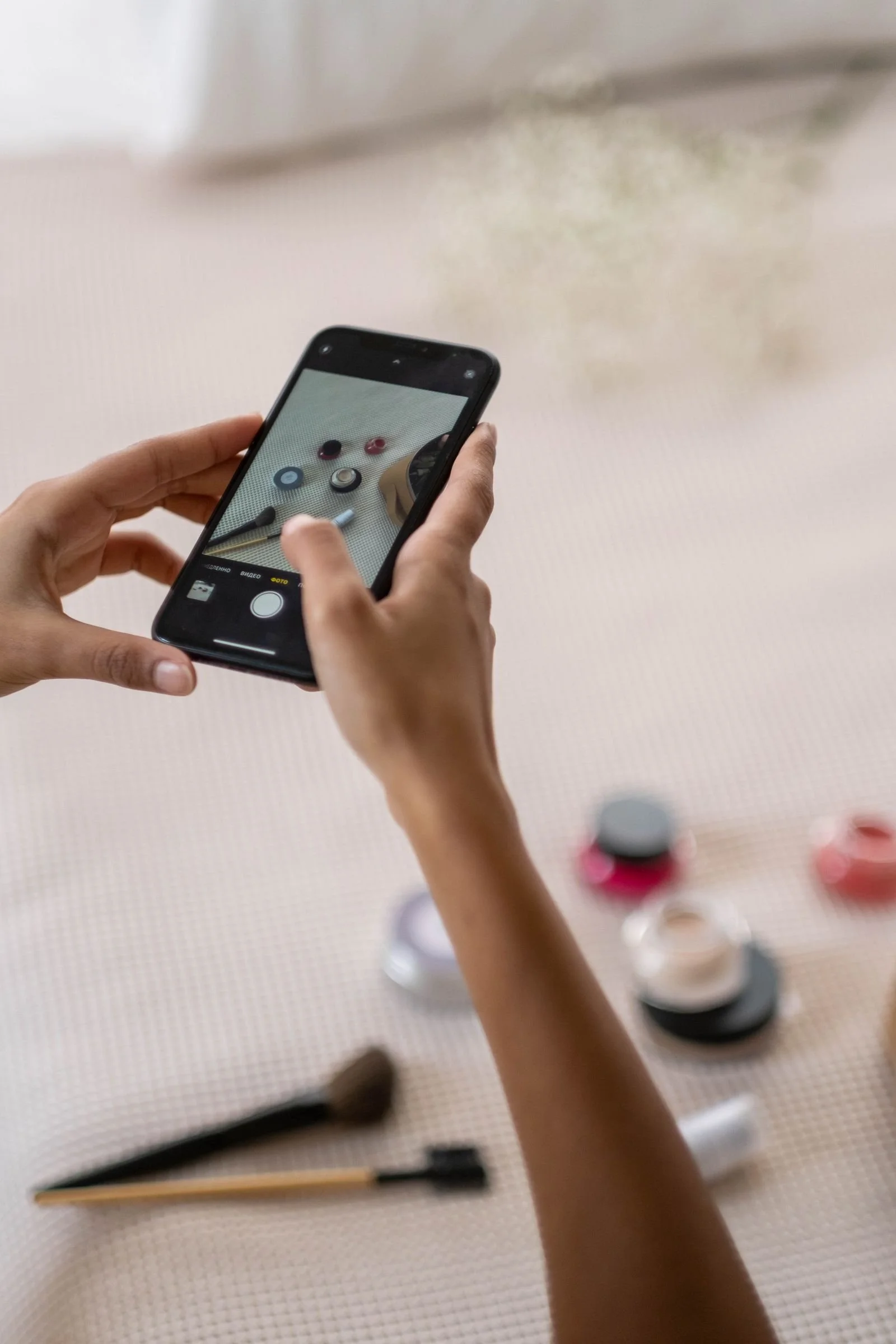
Photography and video style. Decide on a treatment and hold it: bright and clean, warm and moody, bold and colorful. Edit your photos with the same preset or settings. Shoot in similar light where you can. You do not need a professional camera for this; you need consistency, decent light, a clean background, and a wiped lens, which fixes a shocking percentage of "unprofessional" content.
Templates for recurring formats. Quotes, tips, announcements, and testimonials should live in a small set of branded templates. Templates do double duty: they make production faster and they make your account instantly recognizable in a feed, which is the real goal. Recognition is what professional actually means in a scrolling environment.
Upgrade the Content Itself
Covers and first frames. On reels and carousels, the first frame is a headline and a design surface, not a random freeze-frame. Add a clear title in your brand fonts. A feed of clean, titled covers reads as a library from a serious business; a feed of blurry mid-sentence frames reads as an afterthought.
Captions. Write captions with line breaks, a real opening line, and a consistent voice. Walls of unbroken text and caption-length hashtag piles look dated and careless. Put hashtags in a tidy group at the end or in the first comment, and keep your calls to action clean: one per post, specific, easy to follow.
Audio and quality basics. Export video at the highest quality your tools allow, upload over a good connection, and check every post after it publishes. Catching a glitch, a typo in a text overlay, or a cover that cropped badly is a five-second habit that separates established accounts from casual ones.
Pinned posts. Pin up to three posts that introduce the business: who you are, what you offer, and your strongest proof. A new visitor should be able to get the whole story in under a minute without scrolling.
This is the point where many owners realize the content itself is fine and the system around it is what is missing. Building that system, templates, standards, and a rhythm you can keep, is exactly the kind of project we take on. Send us an inquiry and tell us what your account looks like today.
The Details Most Accounts Miss
Consistency beyond the feed counts. Your stories should use your fonts and colors, not a rotating cast of default stickers. Your profile should look current: no outdated hours, retired services, or expired offers lingering in highlights and old posts that still get discovered. Your responses to comments and messages are part of your professional presentation too. Prompt, courteous, well-written replies are branding, and slow or sloppy ones quietly cost sales that you never hear about.
Check how your account looks to a stranger, regularly. Log out or ask a friend to open it cold and answer: what does this business sell, who is it for, does it look active and trustworthy, and what would you do next? If any answer is fuzzy, you have found your next fix.
Use Faces, and Keep the Account Alive
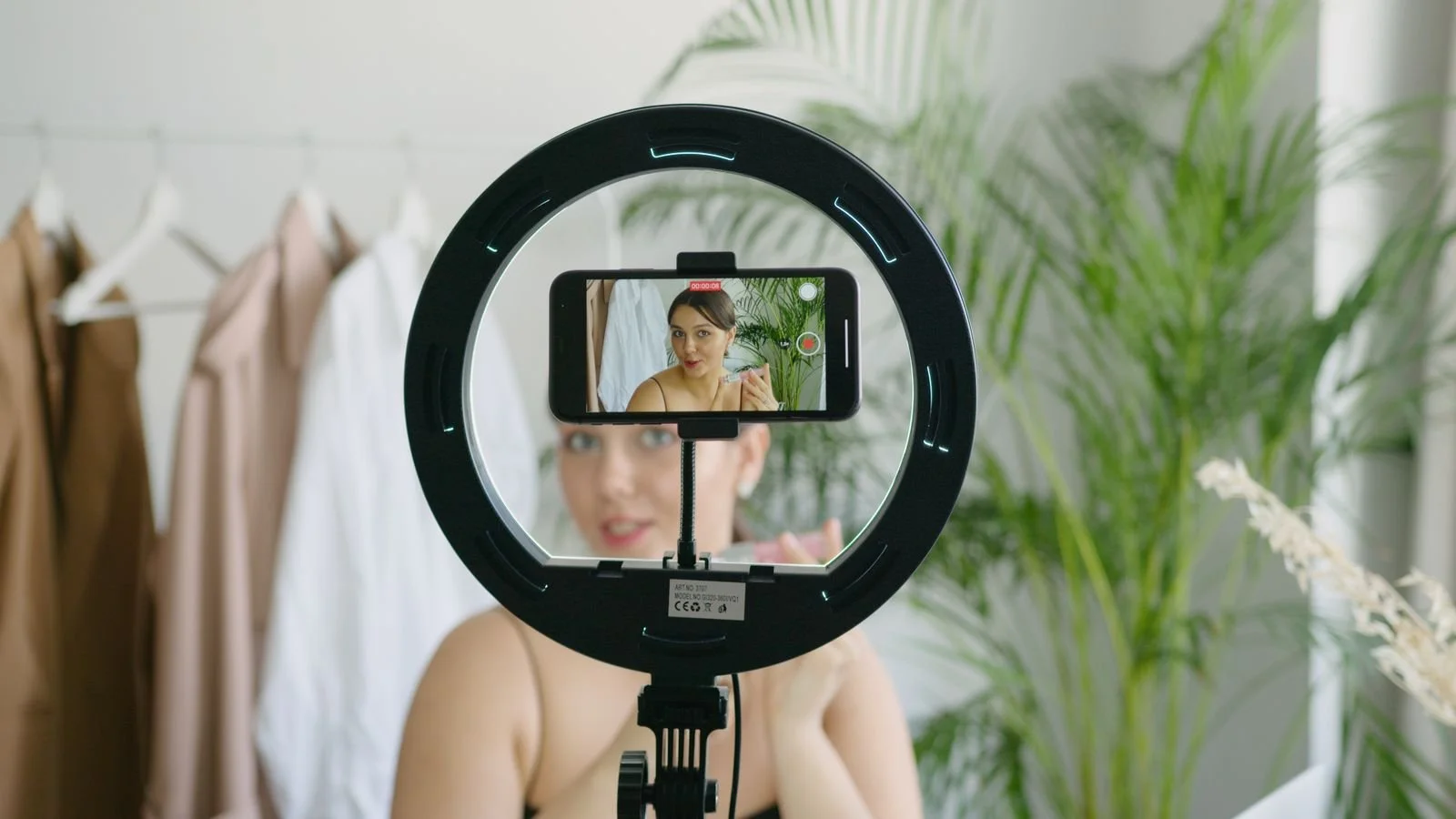
People trust people, and accounts that show the humans behind the business almost always read as more established than accounts built entirely from graphics and product shots. This does not require professional headshots. It requires showing up: the owner on camera explaining something she knows, the team at work, the process happening in real spaces with real light. A face speaking with confidence signals a real business with real accountability behind the account, which is exactly the feeling a professional presence is supposed to create.
Activity level is also part of the impression. An account that has not posted in two months looks closed, whatever the bio says, and an account with a current story and recent posts looks open for business. If your posting rhythm is slow, a modest but unbroken cadence looks far more professional than bursts followed by silence. Round out the habit with a light monthly cleanup: check the link, scan the highlights, remove expired promotions, update anything that changed, and read your own grid as a stranger would. Fifteen minutes a month keeps the storefront swept.
Showing up on camera and keeping the cadence alive are both easier with a team behind the account. If your Instagram needs to look like the business you have actually built, book a free strategy call with Elysia and let us show you what we would do with it.
Professional Is a System, Not a Photoshoot
One polished week will not do it. Accounts look professional because someone made the profile deliberate, built a simple visual system, and then held the standard on an ordinary Tuesday, not just on launch day. The encouraging part is that none of this requires a big budget or a big audience. It requires decisions, written down and applied. Do that for a quarter and your account will stop looking like a side project and start looking like what it is: the storefront of a real business, open around the clock. And the payoff compounds beyond appearances. A professional account shortens every sale that follows it, because the customer arrives already trusting the business. She has questions about fit and timing, not about whether you are real. That head start is worth more than any single post will ever be, and it is available to any business willing to be deliberate.
Work With Elysia
If your Instagram does not yet match the quality of the business behind it, that gap is fixable, and it is the kind of fix we make every week at Elysia Social, from full brand identity to ongoing social media management. Book a free strategy call: https://elysiasocial.hbportal.co/schedule/644c0e279aa74d11e9f50fce or send an inquiry through https://www.elysiasocial.com/inquire and tell us what you are working on. We reply within 48 hours.
